


‘Too Me, Or Not ‘Too Me?
I’m deep in the throes of a tattoo dilemma. I just got home from pussing-out on having a tattoo done. I can’t decide what I want.
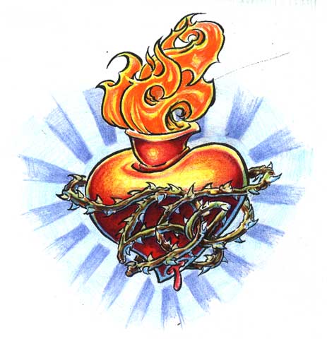
It started with this, the original design for the tattoo; it was done by an artist in Dallas who didn’t want to make any changes at all to his original sketch. I had paid him a deposit for the tattoo he never did, so I kept the sketch and moved on.
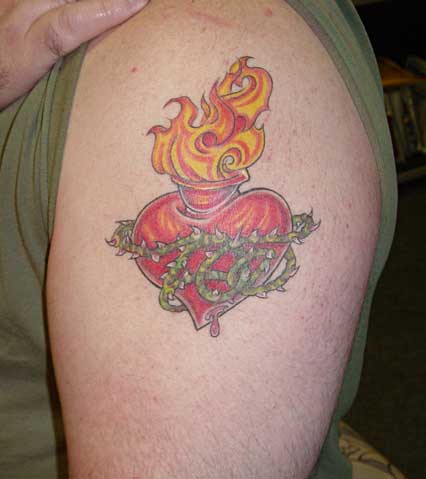
This is where it is now after I found an artist who I could work with: Dano at Art To The Bone in Sherman Oaks. I made a few minor changes to the design myself and Danno inked it. I like it … but it needs more.
This is the design Dano came up with to add as a background.
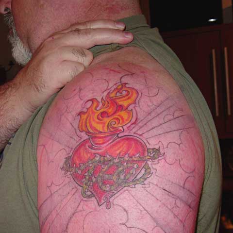
…and this is the tattoo I just pussed out on after Dano had drawn it on and was about to start with the needle. He went ahead and colored it in with marker so I can see sort of the final product and think about it and live with it for a few days.
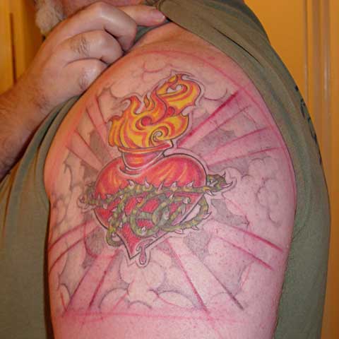
I like it … and I don’t like it. It depends on which 5 minute period you ask me. I can’t make up my mind. My original thought was to have some kind of rays, like sunlight, coming from behind to highlight it, but then that started to seem too cheesy. I liked Dano’s first design with the clouds, but I don’t like how dark he wanted to do them — it seems like it takes away from the heart and makes it seem darker. I want something that will enhance it, not overpower it. On the one hand I think less is more, on the other hand I like the idea of the negative space in the cloud design.
I welcome any comments you readers care to make. Make my decision for me, won’t you, please?
Well, I think the final picture (the one with both the dark clouds and the light ones) works best.
Just my 2c.
Friend, colleague, fellow professional, I implore you bask in the glory that is pristine flesh, do not give up that large a canvas for another’s craft. Subtlety, sublimity, pause-giving cleverness, these are the hallmarks of character. But a big honkin’ pump flying through iffy weather? Nah.
why not tattoo a “hypno-wheel” behind it, like this (not sure if html tags are aloud here, but I’ll try):
hypno-wheel
OK, I guess html tags are not allowed… the link is at http://www.gemtree.com/shoot/hypno.gif
Okay, thanks for the comments, all y’all. I still don’t know what I want to do, but I know I made the right move in doing nothing when it felt wrong. I’ll just wait until inspiration strikes … or until I feel “hyp-mo-tized” from that graphic Gavin pointed us to…
I dunno, man. This design reminds me of a hot water bottle dripping blood on one end and emitting tissue paper on the other, all inexplicably encircled with thorny rose canes. But if it speaks to you, then it does. I like it much better without all the clouds and rays purely from a design perspective.
Some similarities to the cover art for a book at the URL I listed in the comments. (Not my web site.)
Here is the web site:
http://hometown.aol.com/aztlanahuac/myhomepage/index.html